
Mobile trends 2015

Mobile trends keep changing and evolving in order to further optimize user interface (UI) navigation and user experience (UX) design. New terminologies are introduced in the mobile market, others evolve and new inventions are about to come, because the need for progress never stops, is endless!
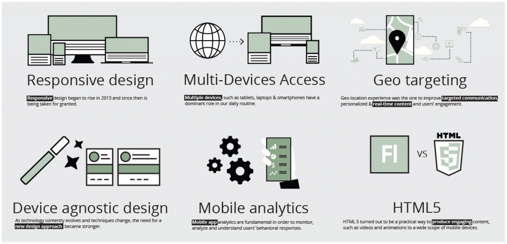
Responsive design
Responsive design began to rise in 2013 and since then is being taken for granted.
Adapting your page, so as to keep your content responsive in all kinds of devices and different screen dimensions has become a necessity in order to improve UX.
Device agnostic design
As technology contently evolves and techniques change, the need for a new design approach became stronger. Device agnostic design means that your website or app is compatible with a wide range of devices, without having to make any custom modifications.
Multi-Devices Access
Switching from desktop to mobile or tablet and vice versa is definitely a common habit nowadays.
Multiple devices, such as tablets, laptops & smartphones have a dominant role in our daily routine.
Mobile analytics
Mobile app analytics are fundamental in order to monitor, analyze and understand users’ behavioral responses. Tracking your traffic and audience will help you increase engagement and improve UX.
Geo targeting
Geo location experience was the one to improve targeted communication, personalized & real-time content and users’ engagement. The implementation of Geo location enhanced UX and helped brands to respond better to users’ needs.
HTML5
HTML 5 was undeniably one of hottest trends in web graphic design, which started in 2013. Since then it turned out to be a practical way to produce engaging content, such as videos and animations to a wide scope of mobile devices.
source: elearninginfographics.com